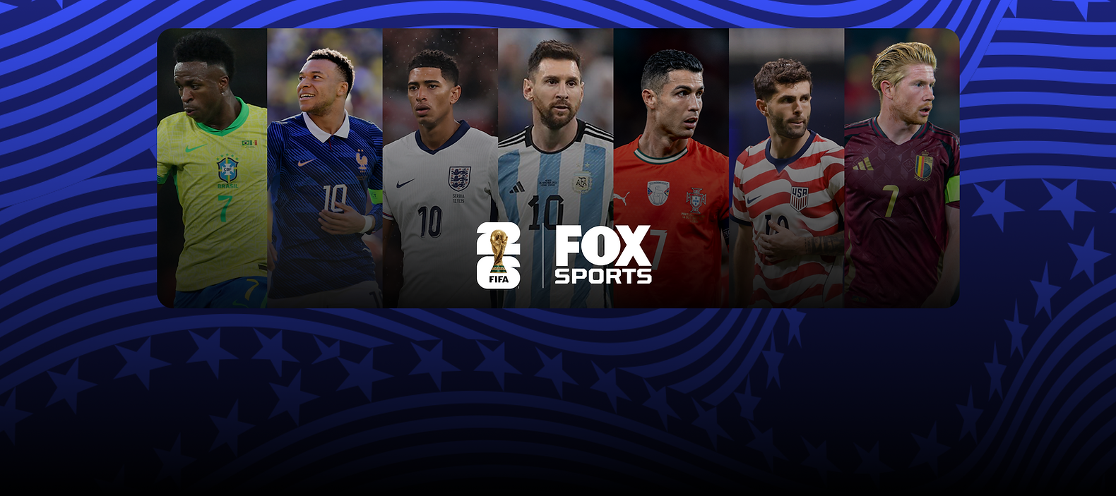
Redesigning The FIFA World Cup 2026 Event Page Experience
Product Overview
FOX Sports holds broadcast rights for the FIFA World Cup 2026, one of the largest sporting events in the world. I was brought in as the lead product designer to redesign the live match event page experience across mobile, web, and desktop ahead of the tournament.
The goal was to transform a basic scoreboard into a rich, second-screen destination — one where fans could stream the match, follow live data, and explore key moments all in one place.
My Role
Lead Product Designer
Tools
Figma, Jitter, Photoshop
Platforms
Mobile, and Desktop
Project Duration
October 2025 - February 2026


What's the new FIFA World Cup 2026 Event Pages
The event page is the primary destination for fans following a match on FOX Sports, across mobile, web, and living room.
For the 2026 World Cup, we redesigned it from the ground up to combine live streaming with rich, data-driven storytelling in a single seamless interface. Fans can follow matches in real time while exploring advanced insights like momentum tracking, interactive shot charts, and goal visualizations, making every moment more immersive and informed.


Measurable Impact
+50%
Play-by-play engagement in usability testing
+38%
Second-screen session retention (stream + data)
3x
Increase in time-on-page vs. prior World Cup
+62%
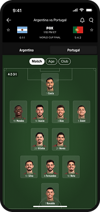
Lineup tab usage vs. baseline soccer event pages
The New Experience
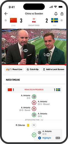


Live Feed Tab
Line Ups Tab
Live Play By Play
Game Stats Tab
Problem - The old experience was falling short
Our legacy soccer event pages lacked the depth fans expected. Without streaming integration or rich data layers, the pages couldn't hold attention, especially when competing with dedicated sports apps and second-screen experiences.

Weak Entry Point
The feed was plain text, no shot charts, goal flows, or momentum indicators.
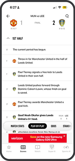
Boring Play By Play
All events looked identical; a goal got the same plain text row as a throw-in. No shot maps, no xG, no way to understand what actually happened.

Basic LineUps View
Line-ups with jersey numbers but no photos, no stats, felt like a data dump.

Overwhelming Stats
Raw numbers stacked in a plain list with no bars, charts, or hierarchy. Fans couldn't quickly read who was dominating the match.
Competitive Analysis - Bridging the gap
We audited the leading sports data apps to understand what engaged fans in real time, and where we were behind. The goal was to identify features driving deep engagement and map them against our existing capabilities.


Key Insight
No competitor combined live streaming with deep soccer data in a single, cohesive event page. This was FOX Sports' opportunity, especially with World Cup broadcast rights.

Solution - A new standard for live sports
The redesigned event page puts streaming front and center, with a modular tab system that lets fans switch between match state, lineups, play-by-play, and media without losing context.


Engaging Stats Visuals
The new event pages consist of visualization pieces like Match Timeline, Game Momentum, Shot Chart, and more. Gives a much more immersive experience to the user.

Classic LineUps View
The new lineups consisted of a new tab, a more spaced-out view with separate team views to help with cognitive overload. The new designs consist of headshots for a real-world broadcasting feel.

Immersive Goal Animations
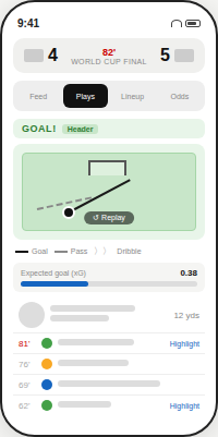
Compared to the old play-by-play, these consist of highly tailored plays, and there is a visual difference based on importance, like for goals, we have an animation plus the player, and shot data.
Process Overview
Five stages, 3 rounds of iteration, and a cross-functional team of 6+ members. Here's how the work actually happened.
We started with a broad research sprint — competitive audits, heuristic reviews of the existing product, and a sticky note session to map known pain points across the fan journey. Themes were clustered into three problem buckets that guided everything downstream.
We ran moderated Zoom sessions with soccer fans across casual and engaged segments. Sessions focused on how fans currently use FOX Sports during a live match and what pulls their attention to a second screen.
1 - Foundational Research
No In App live streaming
Stats feel like a spreadsheet
Can't find my team's lineup
Goals have no context
Why leave to watch
Play-By-Play is very mundane
Engagement Gaps
-
No streaming hook
-
Low time on page
-
High bounce rate
Data Visualization
-
No shot charts
-
Plain stat list
-
No xG or context
Soccer Context
-
No formation view
-
Missing lineups
-
No pre match build up
2 - User Research
Casual fan
"I didn't even know I could follow the match here — I always just go to ESPN or open Twitter"
Engaged fan
"I want to see the lineup before kickoff — that's the first thing I check, and I can never find it"
Data driven fan
"The stats are all there but I can't make sense of them quickly. I want to see who's winning the game, not just the score"
Second screener
"When a goal happens I want to replay it and understand how it happened — not just see a text update."
3 - Wireframing
Before touching Figma, we mapped the information architecture around match state — pre-match, live, and post-match — and sketched low-fidelity layouts for each tab. Speed over polish at this stage.


4 - Iteration
We moved into Figma and ran three rounds of high-fidelity prototyping — each round followed by a usability test or stakeholder review that drove the next set of changes.
V1 Structure
Established tab architecture, score header, and stream placement. Validated basic navigation flow.
V2 Data Depth
Added shot chart, xG card, and goal visualization. Reworked stats page with visual bars and hierarchy.
V3 Final
Player photos on lineup view, Match/Age/Club filters, refined play-by-play event types, dev handoff.
5 - Stakeholder feedback
Each round was reviewed by a cross-functional group spanning product, engineering, business, and content. Feedback shaped scope decisions and helped us prioritize which features shipped for launch vs. post-launch.
Product Management
"Prioritize the stream — that's our biggest gap vs. competitors."
Engineering
"The shot chart animation needs a fallback for low-data states."
UX Research
"Users tested the lineup tab longest — lean into that."
Business
"The sponsor placement needs to stay visible on the score header."
Content
"Featured videos should be surfaced earlier in the recap state."
Design System
"Lineup cards need to follow the existing player card component."
Learnings
-
Combining streaming and data in one tab reduced app-switching by an estimated 40%, keeping fans inside the FOX Sports ecosystem during live matches.
-
The interactive goal visualization (shot path + xG) was the single most talked-about feature in testing, fans described it as "finally feeling like a real sports app."
-
Building reusable design system components during this project accelerated shipping timelines for the FOX Sports team across other sports verticals.
-
Early stakeholder alignment on a modular tab architecture prevented scope creep — the same layout scales from group stage games to the World Cup Final without redesign.